


number 1 was the group name. number 2 was the picture. number 3 was the fact it was in stereo. number 4 was the track list. number 5 was the motif. number 6 (not on this scan) was the record label and number 7 was the decorative border.

number 1 was the magazine name. number 2 was the picture. number 3 was the bright yellow sub head. number 4 (because the text was bigger) was the colour planning your home feature. numbers 5, 6 and 7 in order down and then number 8 being the price and date.
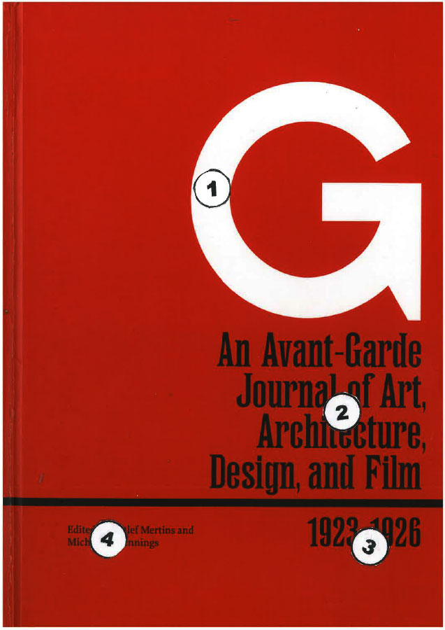
I like this for its simplicity and direct communication. Simple text and no distracting artwork. Nevertheless the design stood out on the shelf between many other books. The white G on the red background. You then read directly down to the subject at number 2 and then to the dates at number 3 and finally across to the editors names at number 4.
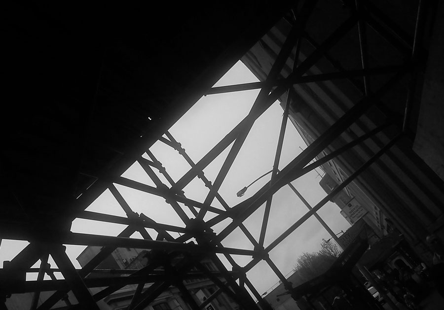
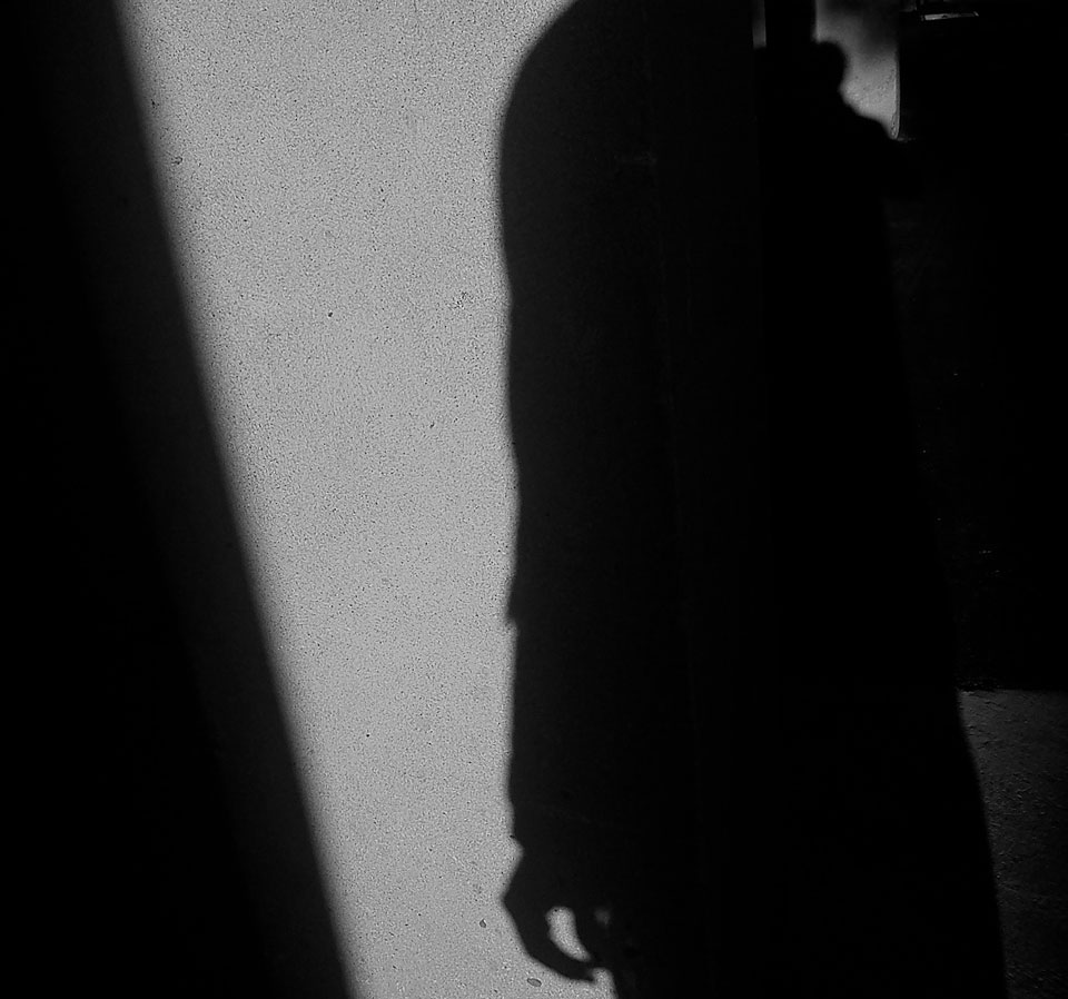
Photographic composition.
Least favourite colour – Yellow. But it seems to appear everywhere.
And had to upgrade wordpress to premium to post an m4v put together in iphoto. (took a while to work that one out).


In this version i used the field blur option in photoshop to slightly blur the background cityscape. I also used it on a couple of the distant house roofs and water.
I also used the jpeg version instead of the png24. This reduced the file size from 907.1K to 122.9K of the jpeg.

The image I chose for this was the .png24. Looking at the three images – the jpg, gif, and png – I didn’t really see that much difference on the screen. The gif colour seemed a bit better, while the png seemed smoother. I could just be imagining that. It is not a big screen. For whatever reason, overall I thought the png looked ‘about right’.
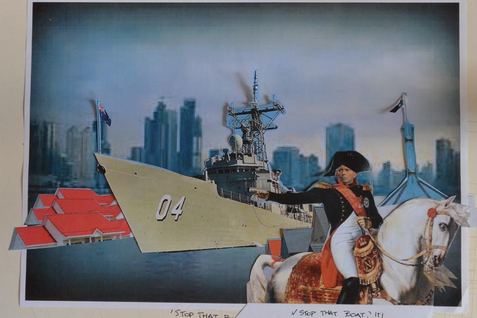
Instead of doing actual drawing sketches, I was collecting images (as I found them and thought of them), cutting them out and just placing them in random little collages and the idea formed that way. There was some development while I was working on the final image.
While thinking about living in an environmentally sensitive way – growing food, solar panels, recycling, water tanks etc. – I read a quote by Ansel Adams.
‘It is horrifying that we have to fight our own government to save the environment.’
Thinking about this, I realised that while government continue to live in denial and people talk about living in an environmentally sensitive way, we continue to vote for morally bankrupt leaders focussed on middle class populist ideals, build unsustainable and insensitive structures, consume unsustainable products, support multi-national corporations and economic rationalism.


Currently looking at a book on Russian Constructivist art. Essentially Malavich. Personally, I have a preference for Rodchenko. Anyway, I appreciate the graphic design element. Bold, geometric, clean, direct.
Downloaded a Russian font that I liked on the internet and tried to work out how you then use it in photoshop only to find there was a similar font already in photoshop, so I figured I would have a bit of a play with that. Did some rough fooling around with paint and the letters and number and worked out some arrangement that kind of worked for me.
Downloaded the pngtest zip file. Thought I could just put the whole thing in photoshop and type in what I wanted over the top. Didn’t work. Went back and watched the video tutorial.
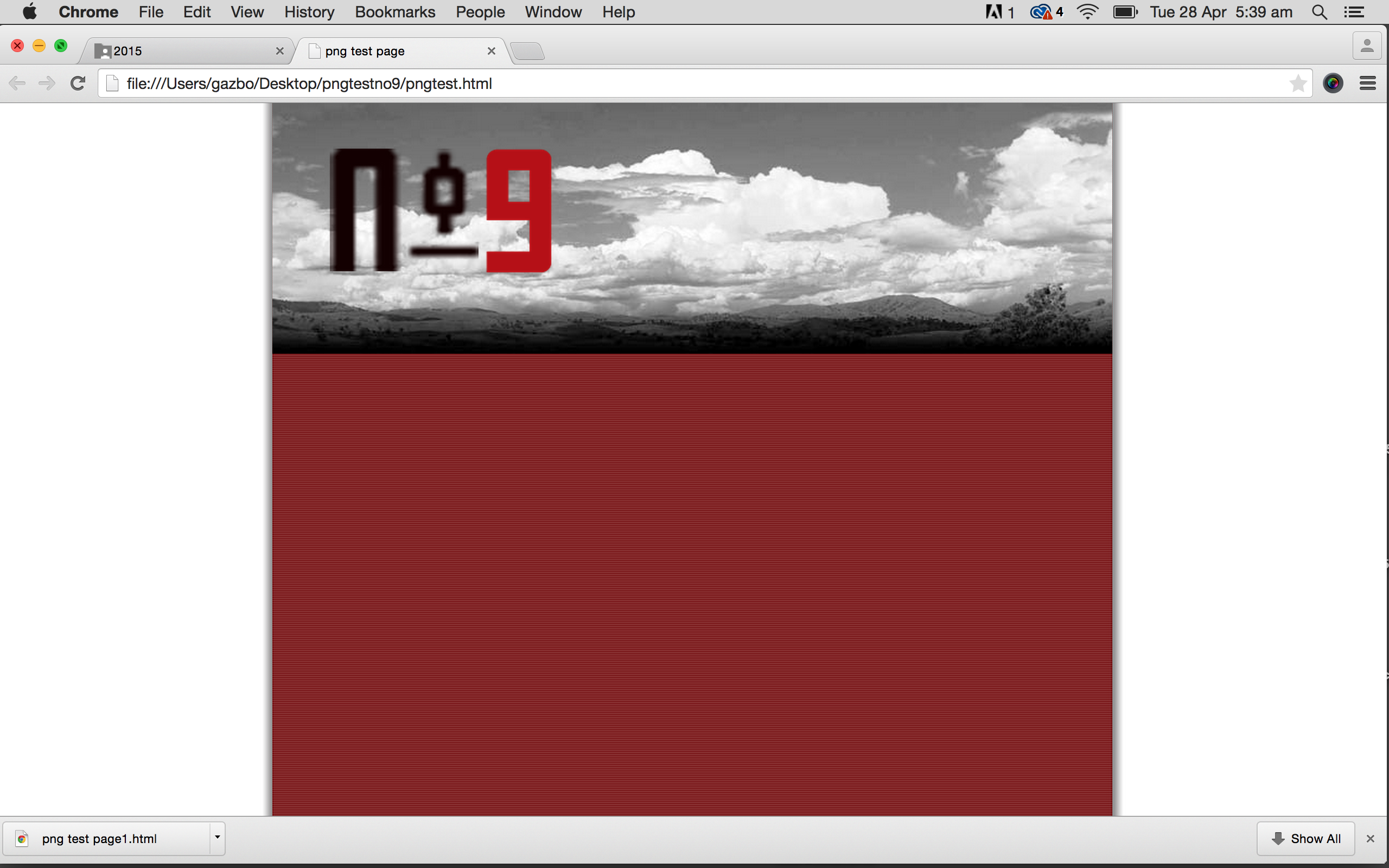
Put the mylogo file into photoshop. Deleted the existing logo. Created a layer for each letter, the number and hyphen. Moved each one into the position I wanted. Merged 3 of the layers and put a bit of a drop shadow. Coloured the number layer and played with the opacity, which I decided I didn’t like and restored it to 100%. Saved all as png 24 and the returned it to the zip file and opened. Decided to change the logo size so returned it to photoshop, resized and then replaced it back in the zip and previewed. Decided I didn’t like the cloud image in colour so put that into photoshop, made it black and white, altered the contrast and saved it as a 60 quality jpeg. Returned it to the zip file. Previewed the whole thing again.
That is the screenshot above.


Not exactly what I started doing. Struggled with this one. Spent way too much time trying to do something else that wasn’t working. Seems to be a few ways to achieve the same result. (quite often I have no idea). Still can’t work out why the thing wasn’t working, but will try to resolve that issue when I have more time. Basically needed to get this task done.
