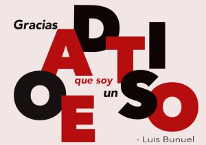
design – lesson 13 – poster design

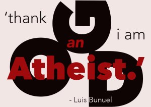
Luis Bunuel quote - english version
Luis Bunuel quote – english version
Luis Bunuel quote - spanish version
Luis Bunuel quote – spanish version.

I chose this quote from Luis Bunuel. ‘Thank God I am an atheist’.

I looked at the example of the poster design in the lesson notes and decided that I was not confident in handling an area totally covered in text. So I simplified the design. Initially I did the design in portrait but then reread the task requirement for it to be landscape. While I was happy with the original portrait design (and annoyed that I had to redo it) I was able to keep some of the original idea and I think it works better in this (landscape) format. Because Bunuel was Spanish I decided to do a version in Spanish (I need the practice). I think I kind of prefer the Spanish version (God – Dios and Atheist – Ateo have the same number of letters which was a bit handy for the design). As for the colour choice – red, black and white (again). It is neat, efficient, stands out and I simply like the combination.

design – lesson 9 – sketching layouts

web layout
web layout

Entry page. I like clean and simple. Think I prefer the second last though. Still needs more thought.

phone app layout
phone app layout

Well I don’t really understand apps. Here I am proposing one to do with experimental film/art. I haven’t quite worked out what I want it to do or for that matter its actual purpose.

businesscard

business card extra
business card extra

Roughly getting there. A few sketch ideas and rough photoshop. Sketches were a bit straight. (as in beige).

design – lesson 7 – grid layout

the age weekend
the age weekend
indesign cover
indesign cover
bar coaster - brunswick hotel
bar coaster – brunswick hotel
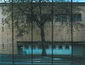
tmag 1966 building - davey street
tmag 1966 building – davey street
artlink cover
artlink cover
tmaggots magazine cover

The two images above – Artlink and The Apple respectively – both use artworks as the cover image. I do not know if they follow the grid or crop the artwork to fit the size of the publication  and then place the text so it is aesthetically pleasing in relation to the artwork. However, inside each publication each article does conform to a grid.

design – lesson 12 – good and bad type

         Good Type

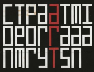
contemporary art tasmanian logo
contemporary art tasmania logo. I think this is quite a good solution. I like the geometric quality and colour emphasis in the word art. Its reference to russian avant guard art. Not easy to read and work out quickly but different and interesting.
architect office, hobart
architect office, hobart. must be black, white and red design day. This is a design for an architect’s practice. Clean, simple, straight forward and no fuss.
pulp friction cafe, hobart
pulp friction cafe, hobart. Of all font styles I think a cursive style is my least favourite but strangely I don’t mind this one. It is reasonably clean, simple and legible. Also vaguely retro in feel.
book cover - ellesworth kelly.
book cover – ellesworth kelly.  A no frills font. Minimal and understated. No capitals. I think suited to the tone of the book and its content.
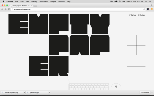
web site
web site. Very chunky font but strangely interesting. Without much else on the page it gets attention. Probably wouldn’t be good if there was a lot of it though.

      Bad Type

dentist office, hobart
dentist office, hobart. Not my favourite place to visit in the first place but I think text that looks like tooth roots are hanging off it is definitely out.
zine flyer
black metal zine flyer. Several styles. Very confused and the headline text I can’t even read. Would I anyway?
band promo flyer
band promo flyer. Different text types with the heading text just plain ugly.
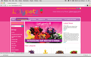
lollypotz web site
lollypotz web site.Difficult to read. Scribble like and colourful on the pink background makes it difficult to focus on. It has no presence.
basra's bananas box
basra’s bananas box. Well not that bad. but not particularly good either. I find  the  yellow text and pink outline quite jarring and distracting and again I am not a fan of cursive fonts.

design – lesson 10 – typeface panel

typeface panel
typeface panel
second attempt
second attempt

The typeface I chose for this exercise was arial. I chose arial primarily because I am familiar with the type and have used it generally in the past. Not really in a design sense. I liked it because it was easy to read, use and not a ‘fussy’ type. Maybe I mean not ‘fancy’ there. Arial was designed in 1982 by a design team led by Robin Nicholas and Patricia Saunders for Monotype Typography. It was designed as an alternative to Helvetica the dominant typeface for design and printing from the 1950’s. Arial has an identical character width and weight to Helvetica, so a document designed using Helvetica could be printed correctly without having to pay for a Helvetica license. Arial is easy to read and can be used in advertising,, book design, posters, large print ads, logos and practically ant other design use. I read another article during this process which stated that arial is, in fact, overused and that a lot of designers dislike it and will only use it if a client insists it be used

design – lesson 2 – identifying elements and priciples

practical householder 1963

One of those times when it would be wise to read the tasks following the original task and plan ahead. I actually find this magazine cover a bit tricky in terms of obvious design principles. For me, the only obvious flow of direction is, basically, down the page. From top to bottom. I move from the title banner – type on a white background (straightforward and easy to read type), then down to the image. I wander around the image for a bit and then move across to the type box on the left of the page. It has a yellow arrowhead box which directs the flow down, through a group of numbered subheads in a white rectangular shaped box. Tere appears to be several different typefaces and font sizes. Following these is a further series of subheads that overlay the image and seperated from each other by a darker line. These again seem to be a larger font size than these previous subheads. From these I then drift across the bottom of the page to another subhead of, again, another font size with a line of all capital letters beneath. Under this is a black line. All other lines down the page were blue. This, I find a bit strange, particularly as the horizontal blue lines are countered by the vertical lines of the drapes the woman is hanging which seems to be the only consistent colour scheme in the design. Aside from the yellow of the arrowhead bit of the box – which really jumps out – the focus for me is the image, with the man and woman. He is sitting and looking up at her, while she is on a step stool looking down. My vision tends to go up – following his gaze to her and then back down to him following her gaze. I did this back and forwards a couple of times.