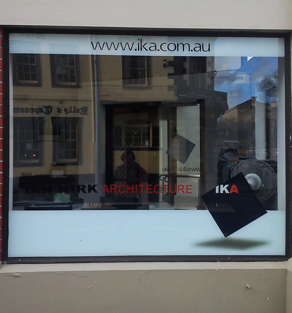
contemporary art tasmania logo. I think this is quite a good solution. I like the geometric quality and colour emphasis in the word art. Its reference to russian avant guard art. Not easy to read and work out quickly but different and interesting.architect office, hobart. must be black, white and red design day. This is a design for an architect’s practice. Clean, simple, straight forward and no fuss.pulp friction cafe, hobart. Of all font styles I think a cursive style is my least favourite but strangely I don’t mind this one. It is reasonably clean, simple and legible. Also vaguely retro in feel.book cover – ellesworth kelly. A no frills font. Minimal and understated. No capitals. I think suited to the tone of the book and its content.web site. Very chunky font but strangely interesting. Without much else on the page it gets attention. Probably wouldn’t be good if there was a lot of it though.
Bad Type
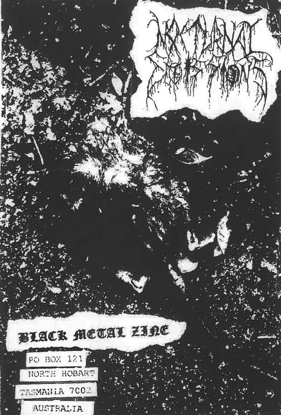
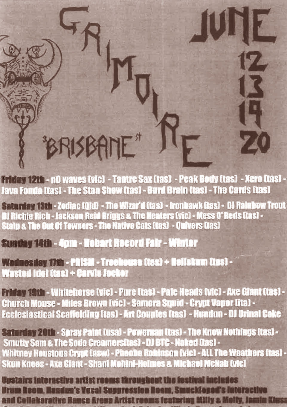
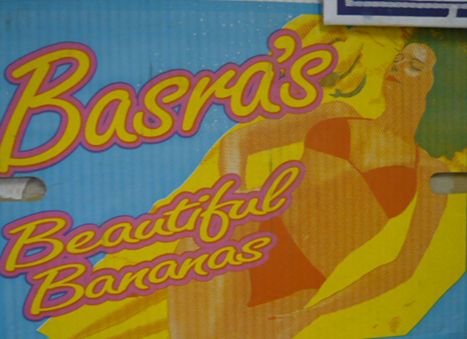
dentist office, hobart. Not my favourite place to visit in the first place but I think text that looks like tooth roots are hanging off it is definitely out.black metal zine flyer. Several styles. Very confused and the headline text I can’t even read. Would I anyway?band promo flyer. Different text types with the heading text just plain ugly.lollypotz web site.Difficult to read. Scribble like and colourful on the pink background makes it difficult to focus on. It has no presence.basra’s bananas box. Well not that bad. but not particularly good either. I find the yellow text and pink outline quite jarring and distracting and again I am not a fan of cursive fonts.