
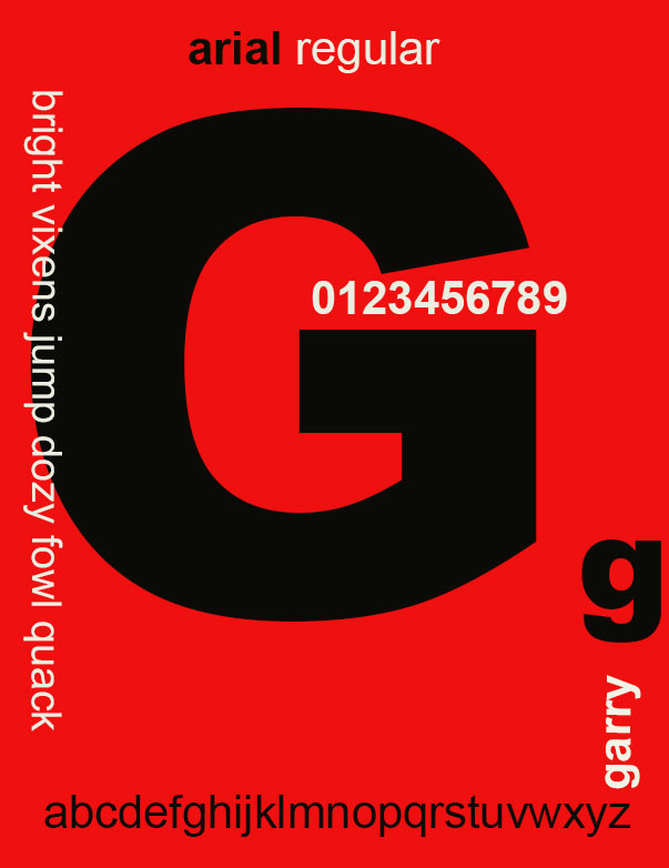
The typeface I chose for this exercise was arial. I chose arial primarily because I am familiar with the type and have used it generally in the past. Not really in a design sense. I liked it because it was easy to read, use and not a ‘fussy’ type. Maybe I mean not ‘fancy’ there. Arial was designed in 1982 by a design team led by Robin Nicholas and Patricia Saunders for Monotype Typography. It was designed as an alternative to Helvetica the dominant typeface for design and printing from the 1950’s. Arial has an identical character width and weight to Helvetica, so a document designed using Helvetica could be printed correctly without having to pay for a Helvetica license. Arial is easy to read and can be used in advertising,, book design, posters, large print ads, logos and practically ant other design use. I read another article during this process which stated that arial is, in fact, overused and that a lot of designers dislike it and will only use it if a client insists it be used
