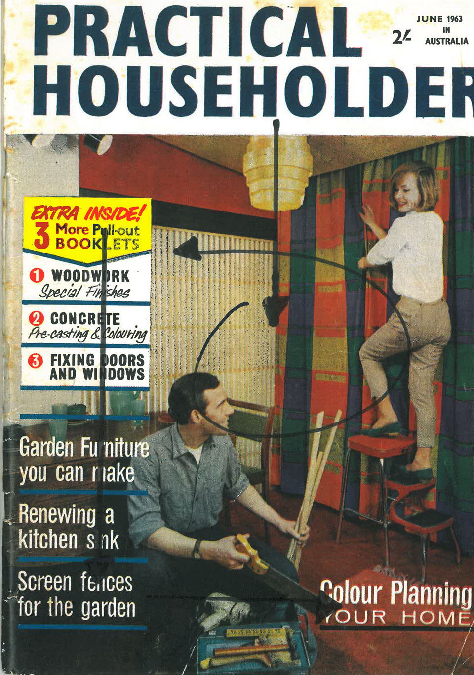
One of those times when it would be wise to read the tasks following the original task and plan ahead. I actually find this magazine cover a bit tricky in terms of obvious design principles. For me, the only obvious flow of direction is, basically, down the page. From top to bottom. I move from the title banner – type on a white background (straightforward and easy to read type), then down to the image. I wander around the image for a bit and then move across to the type box on the left of the page. It has a yellow arrowhead box which directs the flow down, through a group of numbered subheads in a white rectangular shaped box. Tere appears to be several different typefaces and font sizes. Following these is a further series of subheads that overlay the image and seperated from each other by a darker line. These again seem to be a larger font size than these previous subheads. From these I then drift across the bottom of the page to another subhead of, again, another font size with a line of all capital letters beneath. Under this is a black line. All other lines down the page were blue. This, I find a bit strange, particularly as the horizontal blue lines are countered by the vertical lines of the drapes the woman is hanging which seems to be the only consistent colour scheme in the design. Aside from the yellow of the arrowhead bit of the box – which really jumps out – the focus for me is the image, with the man and woman. He is sitting and looking up at her, while she is on a step stool looking down. My vision tends to go up – following his gaze to her and then back down to him following her gaze. I did this back and forwards a couple of times.
