
number 1 was the group name. number 2 was the picture. number 3 was the fact it was in stereo. number 4 was the track list. number 5 was the motif. number 6 (not on this scan) was the record label and number 7 was the decorative border.

number 1 was the magazine name. number 2 was the picture. number 3 was the bright yellow sub head. number 4 (because the text was bigger) was the colour planning your home feature. numbers 5, 6 and 7 in order down and then number 8 being the price and date.
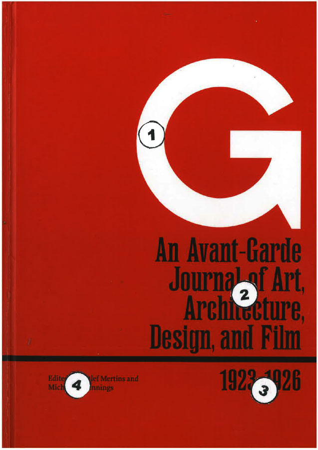
I like this for its simplicity and direct communication. Simple text and no distracting artwork. Nevertheless the design stood out on the shelf between many other books. The white G on the red background. You then read directly down to the subject at number 2 and then to the dates at number 3 and finally across to the editors names at number 4.
