Currently looking at a book on Russian Constructivist art. Essentially Malavich. Personally, I have a preference for Rodchenko. Anyway, I appreciate the graphic design element. Bold, geometric, clean, direct.
Downloaded a Russian font that I liked on the internet and tried to work out how you then use it in photoshop only to find there was a similar font already in photoshop, so I figured I would have a bit of a play with that. Did some rough fooling around with paint and the letters and number and worked out some arrangement that kind of worked for me.
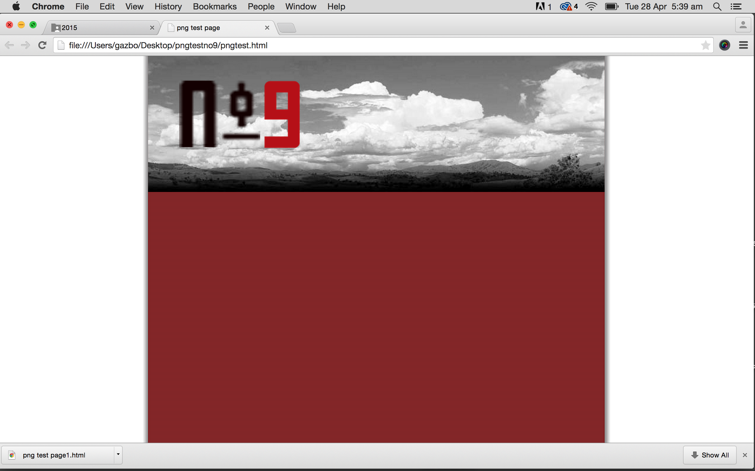
Downloaded the pngtest zip file. Thought I could just put the whole thing in photoshop and type in what I wanted over the top. Didn’t work. Went back and watched the video tutorial.
Put the mylogo file into photoshop. Deleted the existing logo. Created a layer for each letter, the number and hyphen. Moved each one into the position I wanted. Merged 3 of the layers and put a bit of a drop shadow. Coloured the number layer and played with the opacity, which I decided I didn’t like and restored it to 100%. Saved all as png 24 and the returned it to the zip file and opened. Decided to change the logo size so returned it to photoshop, resized and then replaced it back in the zip and previewed. Decided I didn’t like the cloud image in colour so put that into photoshop, made it black and white, altered the contrast and saved it as a 60 quality jpeg. Returned it to the zip file. Previewed the whole thing again.
That is the screenshot above.
